Weather Patterns and High-Pollution Days
Hypothesis
Science Concepts Learned
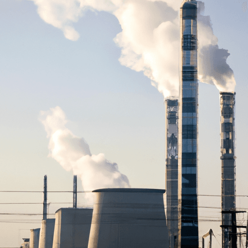
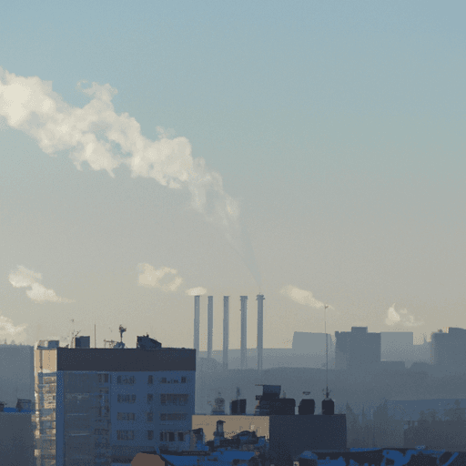
Pollution levels are not the same every day, and weather conditions may be why. Temperature, wind speed, and barometric pressure all shift from day to day — and so do readings for carbon monoxide, particulates, and ozone. By graphing weather measurements alongside pollution data on the same chart, you can compare the patterns and spot which conditions line up with the worst air quality days.
Carbon monoxide is a harmful gas with no color or smell that comes from burning fuel. On high-pollution days, this invisible gas builds up near the ground. Cities like Phoenix track pollution readings alongside daily weather forecasts because weather and pollution levels shift together — sometimes dramatically. You collect temperature, wind speed, barometric pressure, carbon monoxide, particulates, and ozone readings each day, then graph them all on the same chart. Comparing those graphs reveals which weather conditions line up with the worst air quality days.
Ozone is a form of oxygen that collects near the ground on certain days, contributing to poor air quality. When weather conditions trap pollutants close to the surface, ozone levels can spike. Tracking ozone alongside temperature, wind speed, and barometric pressure reveals which weather patterns line up with the worst pollution days.
Barometric pressure, the weight of air pushing down at ground level, varies from day to day alongside other weather conditions. When you graph barometric pressure and pollution readings on the same chart, you can spot whether high-pressure days line up with the worst air quality. Comparing these measurements helps reveal how the weight of the air above a city connects to pollutant levels recorded below.
Method & Materials
Tinker Crate — science & engineering build kits for ages 9–12 — real tools, real experiments, delivered monthly. (Affiliate link)
See what’s includedResults
Why do this project?
Also Consider
Full project details
Additional information and source material for this project are available below.Related video
Related Science Fair Project Ideas